Slide 1 of 3

High quality

Robust components designed for all users. Carefully tested to guarantee consistent performance and stability.

Clean, predictable APIs that work seamlessly across platforms and environments.

Customizable

Offers the flexibility developers need to create tailored components while reusing familiar interaction patterns.

Easily adaptable to match your project's style guidelines and design language.

Accessible

Built with accessibility best practices in mind, including full support for WAI-ARIA standards.

Seamlessly integrates into new or existing applications to deliver inclusive user experiences.

FAQ

Universal UX is a high-quality Angular component library designed to be robust, accessible, and fully customizable. It provides reusable components that can adapt to different projects and design styles.

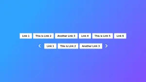
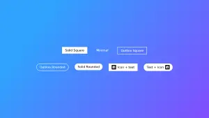
The library includes components such as Expand, Scroll Nav, Content Carousel, Hero Carousel, Content Card, Theme Toggle, Menu Toggle, and Link Button. Each component is built to integrate seamlessly into existing or new Angular applications.

Yes. All components follow best accessibility practices, including full support for WAI-ARIA standards. This ensures that components are inclusive and usable with screen readers and other assistive technologies.

Absolutely. Universal UX provides clean and predictable APIs along with customization options that allow you to adjust colors, styles, and behavior, making it easy to integrate components with your design system.

You can install the library via npm and import only the components you need. The documentation includes clear examples for each component and complete kits, such as the Toggle Kit or the UUX Full Collection, to help you quickly integrate them into your projects.